Passo & Passeio: two new fonts from Fabio Haag, inspired by the rhythms of life
We introduce two cool new fonts from the Brazilian type foundry and explain their inspiration.
Passeio
We're always on the lookout for cool new fonts at Creative Boom, and delightfully, two have arrived at once in our inbox. They come courtesy of Fabio Haag, a type designer with more than 14 years of experience, including nearly ten as deputy creative director at Dalton Maag in London.
In 2016, he returned to his home country of Brazil to found Fabio Haag Type, which specialises in designing typefaces that aim to increase brand value and simplify font licensing.
"As an independent type foundry in Brazil, thriving in this industry can be quite challenging," says Fabio. "However, our team has grown to five designers, and we are excited to announce the release of two new complementary typefaces this week."
Forward thinking
The development of Passo and Passeio was led by Ana Laydner, with assistance from Henrique Beier, Eduilson Coan and Fabio Haag. Both are inspired by the different rhythms of life.
Passo & Passeio
Passeio detail
Passo detail
"With one foot in front of the other, step by step, we keep drawing and living," explains Fabio. "The gentle breathing in silent meditation. Galaxies are expanding in the universe. Leaves are growing in the apartment.
"One thing connects it all," he continues. "To be alive is to be moving. On a daily basis, we accelerate the pace. Routine, form following function. Looking forward to the weekend chill. Or rather, this afternoon? Can we make it work?"
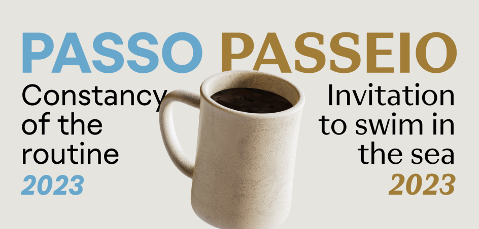
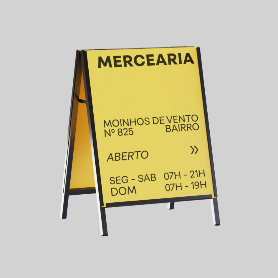
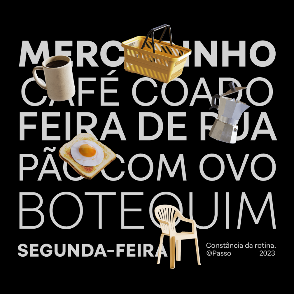
So, how do these ideas inform the design of the fonts? "Passo has the constancy of the routine," he explains. "Monolinear, with low contrast, delivers the message efficiently and directly. It is the coffee to repeat at any time of the day. It will help you solve various challenges without raising existential questions."
Passo
Passo
Passeio
Passeio
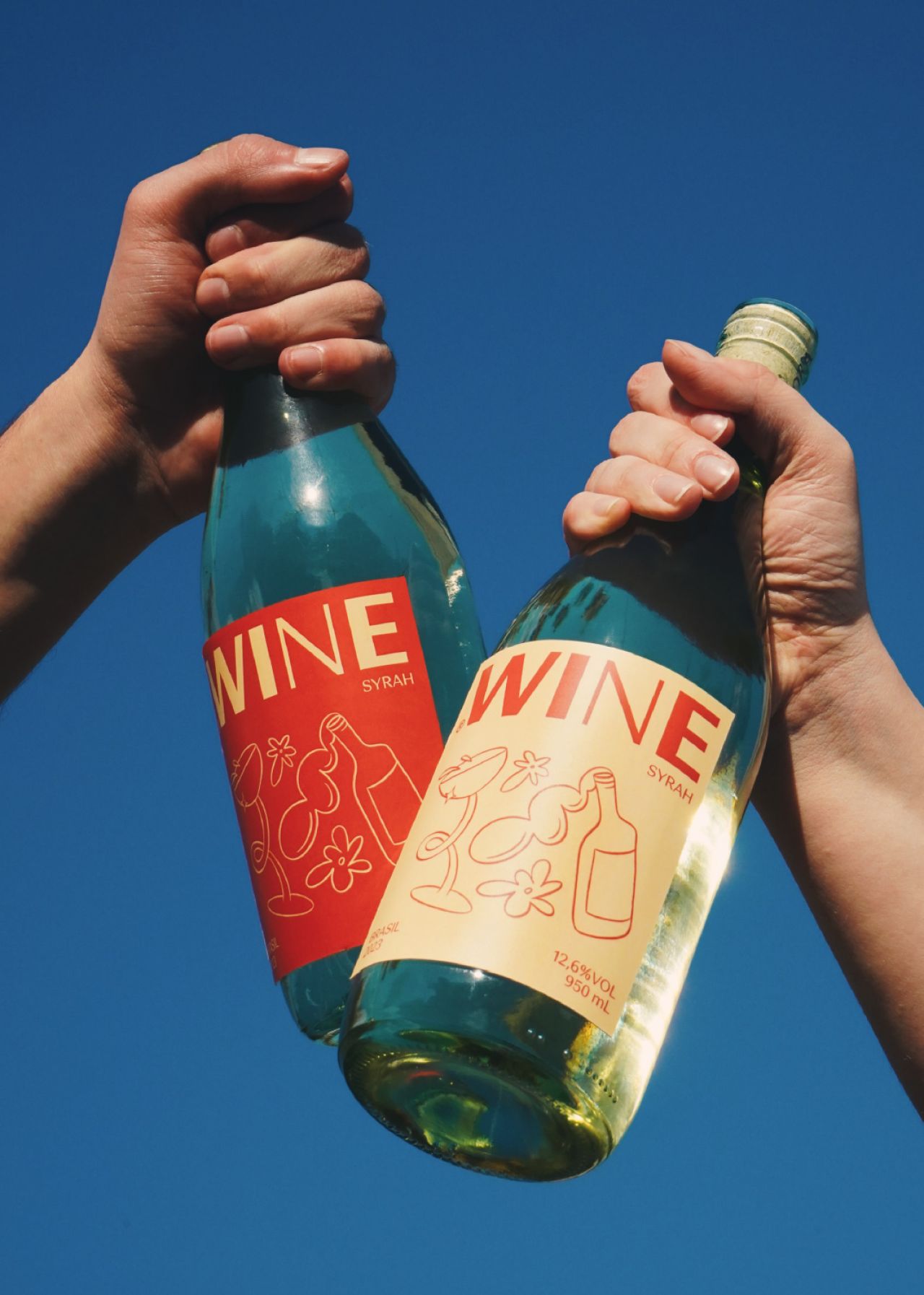
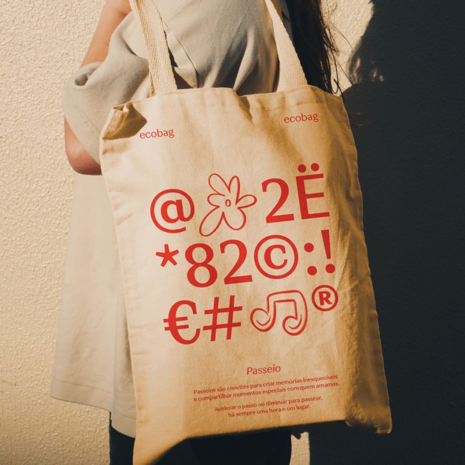
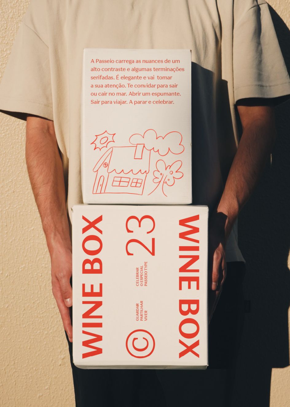
Passeio, on the other hand, carries the nuances of a medium contrast and a few serifs. "It is elegant and will catch your attention. Ask you out or invite you to swim in the sea. Open a sparkling wine. Go out to travel. To stop and celebrate."
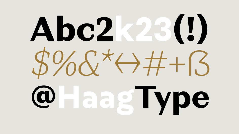
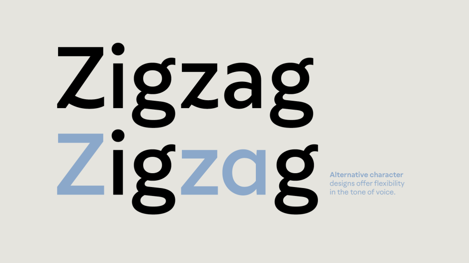
Both fonts are available in eight weights and two styles and features support for 209 languages based on the Latin script.
Editor's Picks


Trending


](https://www.creativeboom.com/upload/articles/86/862919952c0ad18439004228895a431dc6e45ffc_732.jpg)

Podcasts


Editor's Picks
Further Reading