A LINE devises new name and identity for business security platform, putting a unique spin on cybersecurity
Taking it from corporate and technical to cohesive and approachable, A LINE developed a suite of rounded, dimensional graphic assets, all inspired by Rotate's hero "r" symbol.
Global branding studio A LINE has rebranded the new cyber security platform Rotate – formerly Armoz – ditching its corporate look and feel for a friendly and intelligent identity.
Rotate works to protect and insure small to medium-sized businesses with its modern approach to cyber security. Traditional cyber security solutions have focused on the enterprise, but millions of attacks on small businesses occur every year, and nearly 90% of owners feel vulnerable to cyber attacks.
This was when Rotate stepped in, seeking to create a solution for businesses of all sizes with backing from investors like Treasury, UpWest, at.inc, and Torch Capital.
Before approaching A LINE, Rotate had already developed the product and worked with Israeli-based brand consultancy SIDE ST to establish a strong, actionable positioning and go-to-market strategy. A LINE partnered with SIDE ST throughout the process, making use of its start-up expertise to turn Rotate's vision into a bold, differentiated brand that supports its business goals and resonates with the market.
Since the company wanted to focus on growth in the US, its brand needed to appeal to small to medium-sized businesses and enterprises in North America. A LINE identified that most cyber businesses felt "technical" and "led with fear".
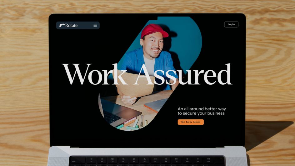
To differentiate Rotate, the studio sought to design an approachable B2B2C brand that connected with key audiences through "approachability, reliability, and trust". An initial immersion phase unearthed key insights that later defined the new strategy, which centres around the brand phrase "Work Assured".
The idea is that it captures that "in an increasingly digital world, where businesses live or die online, customers want simple, effective cybersecurity that revolves around the way they do business", according to A LINE.
Ensuring that the brand resonated with the company's key audience also meant changing the name, as research showed that the original name, Armoz, wasn't achieving this. On the contrary, the name Rotate is simple, assured and effective, as it conveys the idea of 360-degree protection all year round.
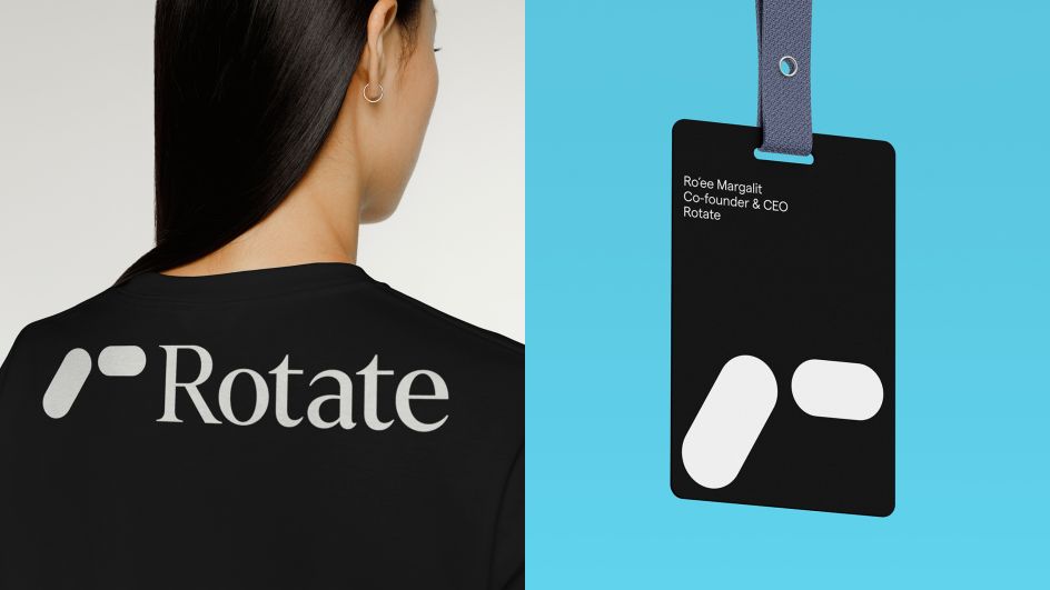
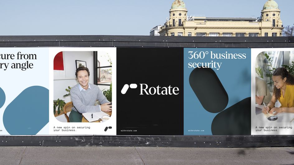
Demonstrating 360-degree protection from a visual perspective involved circling and orbiting graphics that communicate how Rotate considers security from all angles. However, the studio was also conscious of making the visual identity feel human and approachable rather than unsettling and corporate.
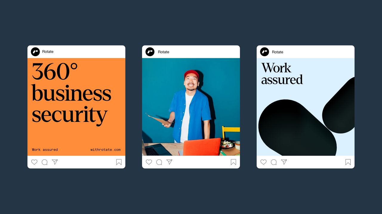
This is when the idea to have a rounded, "friendly 'r'" symbol came about, built with motion in mind. A LINE also extended the compositional shapes into a distinct graphic language that can be used as framing devices throughout the identity system. The cohesive graphic language system, led by rounded, dimensional forms, was designed to rotate and infuse movement and energy.
In a bid to create balance, the hero symbol was paired with an established, "intelligent-feeling" logotype that is "forward-looking yet trustworthy", according to the studio. The specific typefaces used are Denton, from Peregrin Studio, and MatterSQ, from Displaay Foundry, which serve to communicate complex information and deliver impactful statements with clarity.
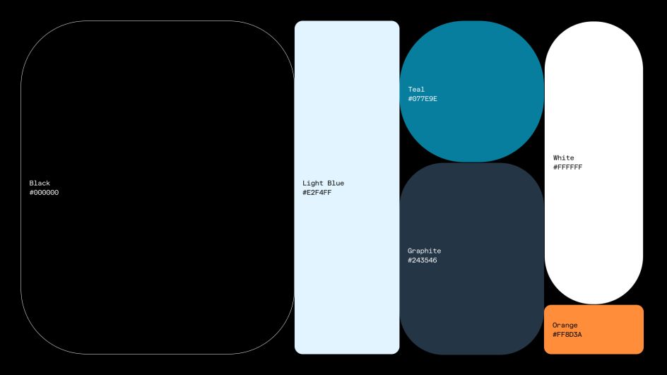
Black and white are the base hues in Rotate's colour palette, as well as teal blue. The thinking was that this minimal palette would instil a sense of safety and reliability, while accents of vibrant orange would bring a sense of energy and draw attention to specific elements within the design system.
To introduce Rotate to the market, A LINE created a simple launch website that gives an overview of the new platform, telling its core story and introducing the new brand. The site was designed through UX and UI as a functional mock-up in Figma, and then built out in Webflow.
As the brand launches in the US market, Rotate expects that it will support customer acquisition, encourage strategic partnerships, and foster additional fundraising.
Rotate said: "A LINE did an amazing job helping create the new Rotate brand. We knew that having a clearly defined, clearly differentiated brand would be key in helping us attain our business goals, and the A LINE team was invaluable in guiding us through the process of articulating and bringing to life our ambitious plans for developing a revolutionary new category."
Editor's Picks


Trending


](https://www.creativeboom.com/upload/articles/86/862919952c0ad18439004228895a431dc6e45ffc_732.jpg)


Editor's Picks
Further Reading