Jules Janssen's playful new book is inspired by 'too much screentime'
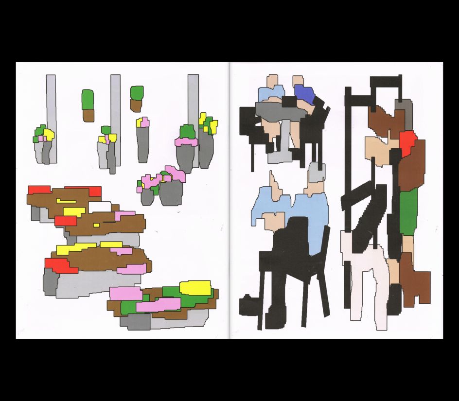
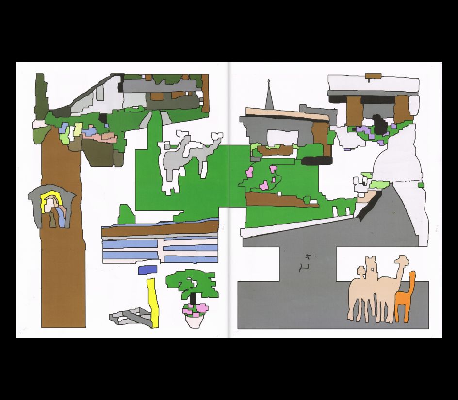
Using Tux Paint as his tool of choice – software similar to Microsoft Paint – the designer has created a bold and blocky publication devised from his lunchtime walks in nature.
Covid-19 has changed aplenty, from the way we work, where we work, how often we work and even who we work for. Jules Janssen, a graphic designer from The Netherlands, switched things up over the pandemic as he started working mostly from his parents' house in the countryside. "They live in a tiny village in the very south of the Netherlands," he explains. "It's exactly the village that will show up when you Google image searches the word 'village'. It's this sort of cliché West-European picturesque village; lots of cows, sheep and deciduous trees."
Currently working remotely, Jules now enjoys long walks on his lunch break as he infuses himself with the leafy nature around him – the perfect antidote to the hours spent in front of a screen. "With square eyes, I would stare at cows, observe hikers and take in the surrounding nature, without really taking it in," he continues to tell Creative Boom. "I was absent, and so were my surroundings." In this context, Jules refers to the difficulty of switching off, especially after leaving the internet and all its immediate, pixelated digital content. This topic has now informed his latest publication, aptly titled 'Walking into Nature, After Five Hours of Non-Stop Screentime'. "There's definitely not a story or some specific message I hope to communicate. Rather, it's more about the absent-minded state itself."
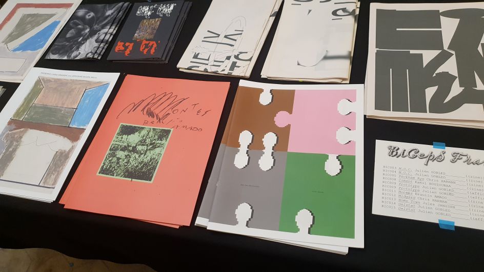
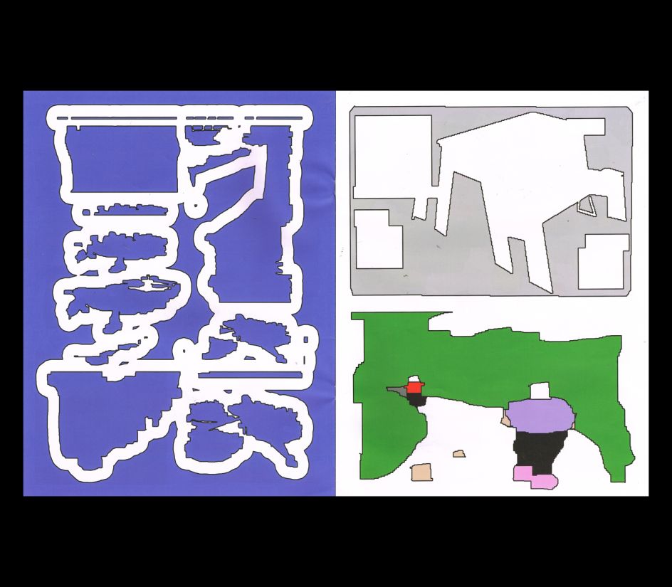
Having devised the idea behind his latest project, Jules was then introduced to a "forgotten" early 2000's software program called Tux Paint. It was fellow student Kexni Hao who reminded him, who studies alongside Jules at Royal Academy of Art, The Hague. Describing it as Microsoft Paint, but for kids, the tool enables creatives to brush and add effects in all its simplistic 2D form. "It's kind of obscure since brushes glitch all the time and the resolution is very low, making everything pixelated in a divergent way," he notes. However, the tool was a fitting choice for the project, which sees a merging of painterly landscapes with the more "blunt" and digital brushes that can only be made through the computer.
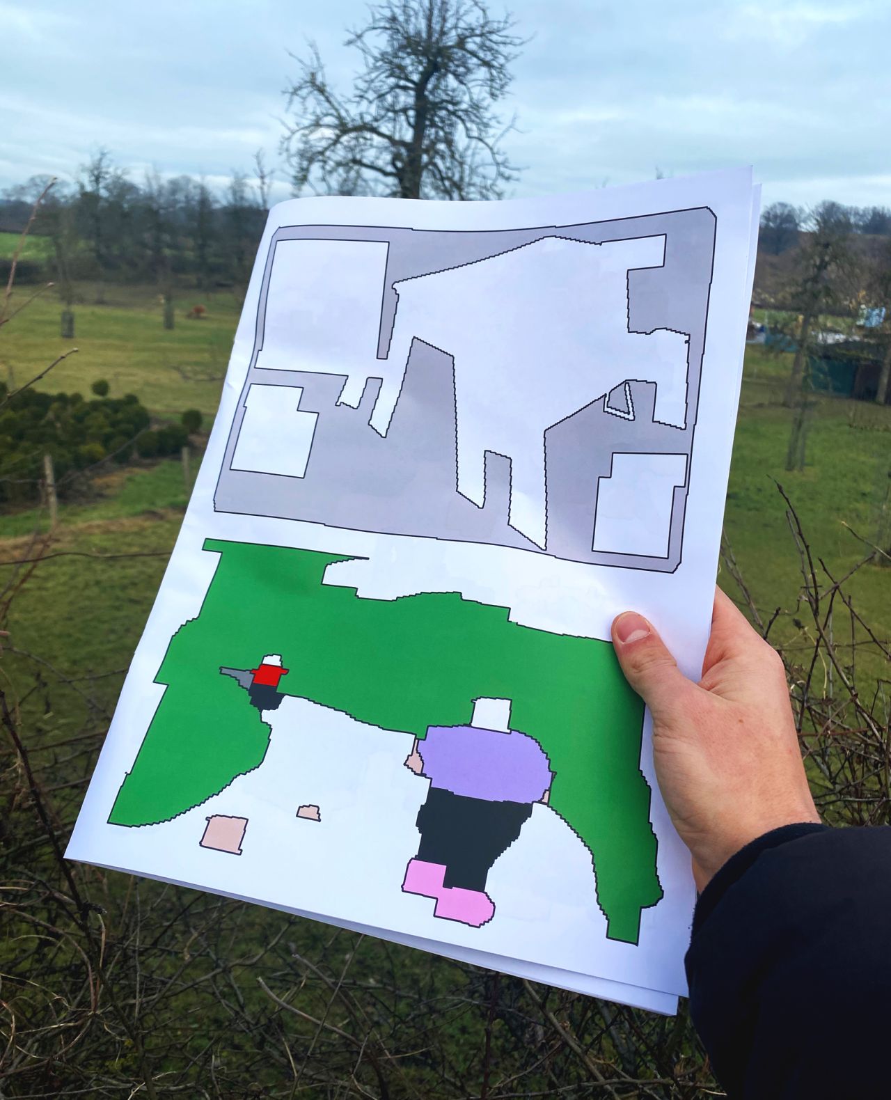
Throughout, you'll see a host of earthy greens and primary colours, blocky shapes and objects reminding us of trees and flora. The subject matter is devised from these long lunchtime walks in the countryside, during which Jules will photograph his surroundings with his iPhone before painting over them in Tux Paint. "The limitations of the program gave me a lot of freedom and confidence in my creative decisions," says Jules. "There's a limited palette, but the colours are great, so I decided to stick to those, providing the publication with uniformity." He also notes that the command +z option doesn't work, which is something he describes as a "blessing".
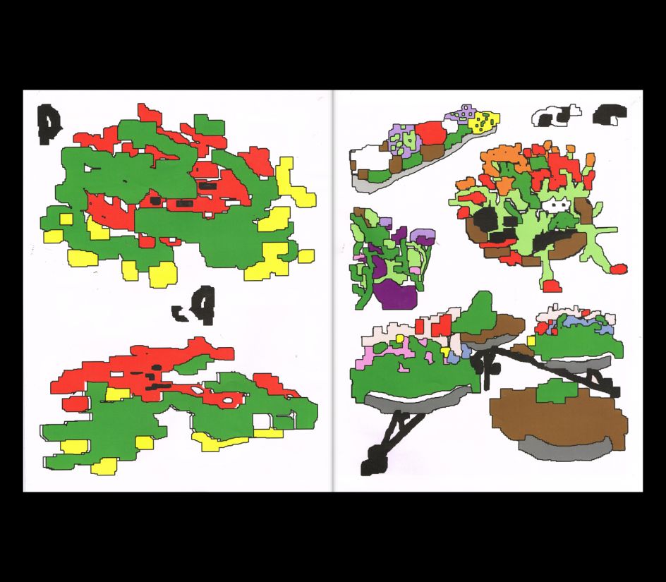
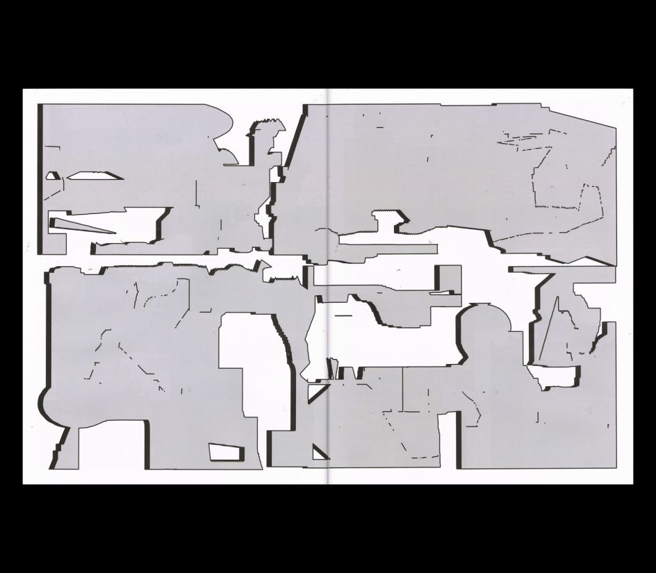
And lastly, Jules wanted to "blow up" the resolution of the compositions in Adobe Illustrator, meaning that he outlined everything and "started assembling, stretching and combining, seeing what new situations would come out." He adds: "I always find myself hunting for architectural compositions first. Then I start deconstructing and finding a sort of pleasing balance. That also goes for meaning and storytelling. I guess it's just nice when the storyteller forgets the story halfway and starts to sing instead."
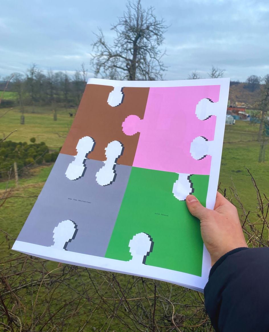
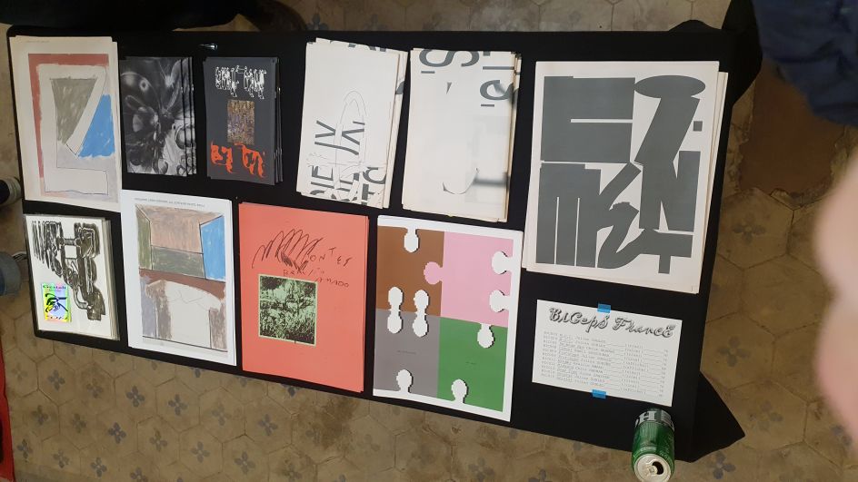
'Walking into Nature, After Five Hours of Non-Stop Screentime' is purposely naive and playful. It gives off a witty and idiosyncratic view of the designer, where he doesn't feel the need to impress by using the latest software; his work speaks for itself in wonderfully simplistic forms. "Print is a great medium for grabbing and holding attention since the viewer actually grabs and holds something," he concludes. "It invites the viewer to look and not scroll quickly in search of stimulation. It's easier to use absence and the tactile qualities of the paper. I think that print is highly underrated for its tactility nowadays. Nothing beats a real drop shadow or flipping a real page. It also makes me suffer less from horror vacui when I know the work is going to be printed, which is really freeing."
